
Decoding the Labor Market: Tracking Jobless Claims with FRED and Python
Exploring Initial Jobless Claims as a Key Labor Market Indicator

Today’s post kicks off a new series dedicated to using macroeconomic data from the St. Louis Federal Reserve (FRED) to make more informed investment decisions. This recurring series will delve into various macroeconomic indicators, exploring how they are calculated and presenting the data in insightful ways to identify economic trends. As always, I’ll provide the complete code, aiming to create a comprehensive almanac of economic insights that readers can easily access and adapt to their own needs.
The Inspiration Behind This Series
Have you ever come across an insightful economic indicator on social media or a research blog, only to find it impossible to replicate because the author didn’t share the methodology or tools? This has certainly happened to me, and that’s why I decided to create this series of posts.
What is FRED?
FRED is a massive database of economic data consisting of hundreds of thousands of time series from scores of national, international, public, and private sources. Specifically, we’ll focus on Initial Jobless Claims, published weekly by the U.S. Employment and Training Administration. I will also explain why this indicator is of particular interest and what it represents.
Getting Started: Obtaining an API Key for FRED
The first step is to get an API key from FRED. The key is free and issued immediately, but you’ll need to create an account and request it. Here’s how to do it:
Go to FRED’s website: https://fred.stlouisfed.org
Create an account.
Click on
My Account => API Keys => Request API Key.When prompted for a reason, you can state that you need the key for research purposes or analysis.
The API key will appear on your API Keys page, and you can copy it from there.
Using fredapi: A Python API for FRED
For today’s post, we’ll use fredapi, a handy Python API for the FRED Web Service created by Mortada Mehyar (GitHub repository). First, install the library:
pip install fredapiNow, let’s set our API key and fetch some data as a test. Below is an example of retrieving the latest release of U.S. Gross Domestic Product (GDP) data since 1947:
import pandas as pd
import numpy as np
from fredapi import Fred
fred = Fred(api_key='Your API key goes here')
GDPLatest = fred.get_series_latest_release('GDP')
GDPLatest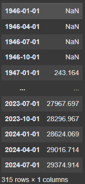
What does latest release mean? Economic data often gets revised after its initial release, sometimes multiple times over weeks or months. The fredapi library allows us to access:
The Latest Release: This provides the most recent revision of a particular data point.
The First Release: This shows the first published value of the data point.
All Releases: This includes all historical revisions, providing a real-time view of the data as it was available at specific points in history.
Latest release function provides us with the latest revision of a particular datapoint. But we can also get the initial release with this API, and the code below does exactly that.
GDPFirst = fred.get_series_first_release('GDP')
GDPFirst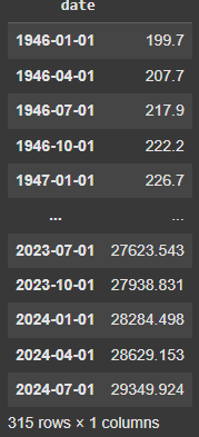
You’ll notice differences between the values for the latest and initial releases. For example, the initial release of quarterly GDP data might differ from its subsequent revisions. Additionally, the API allows us to view all interim revisions between the first and latest releases. Here’s an example:
GDPAll = fred.get_series_all_releases('GDP')
GDPAll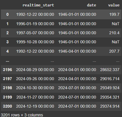
Look at the last three rows of values in the screenshot above. The above demonstrates how the value for Q3 GDP changed over time. On October 30, the initial release showed a value of 29,349.924. This matches the value we got when we called for the first release. This was later revised on November 27 and December 19, with the final value matching the latest release.
This feature is part of ALFRED (Archival Federal Reserve Economic Data), which archives FRED data by adding the real-time period when values were originally released and later revised. While most economists and researchers focus on FRED data for its accuracy, ALFRED is invaluable for avoiding "look-ahead bias" in backtesting. It ensures that only the data available on a specific historical date is used in analyses.
My goal is to provide you with the tools that will give you an edge in the markets. Follow the link below to get 10% off for the next 12 months.
Become a paid subscriber to receive:
Trading indicators and strategies. Full, ready-to-use code for your investing — no black boxes or holy grails, just full transparency and ownership of your advantage.
Weekly newsletter covering current market conditions. Analysis on economic trends, key data releases, and actionable insights to stay ahead of market shifts.
Searching for Specific Indicators in FRED
Now let’s check out another critical function in the API which allows us to quickly search for a specific indicator or data series. The code below searches for the phrase “Jobless claims” in the FRED database.
fred.search('jobless claims').T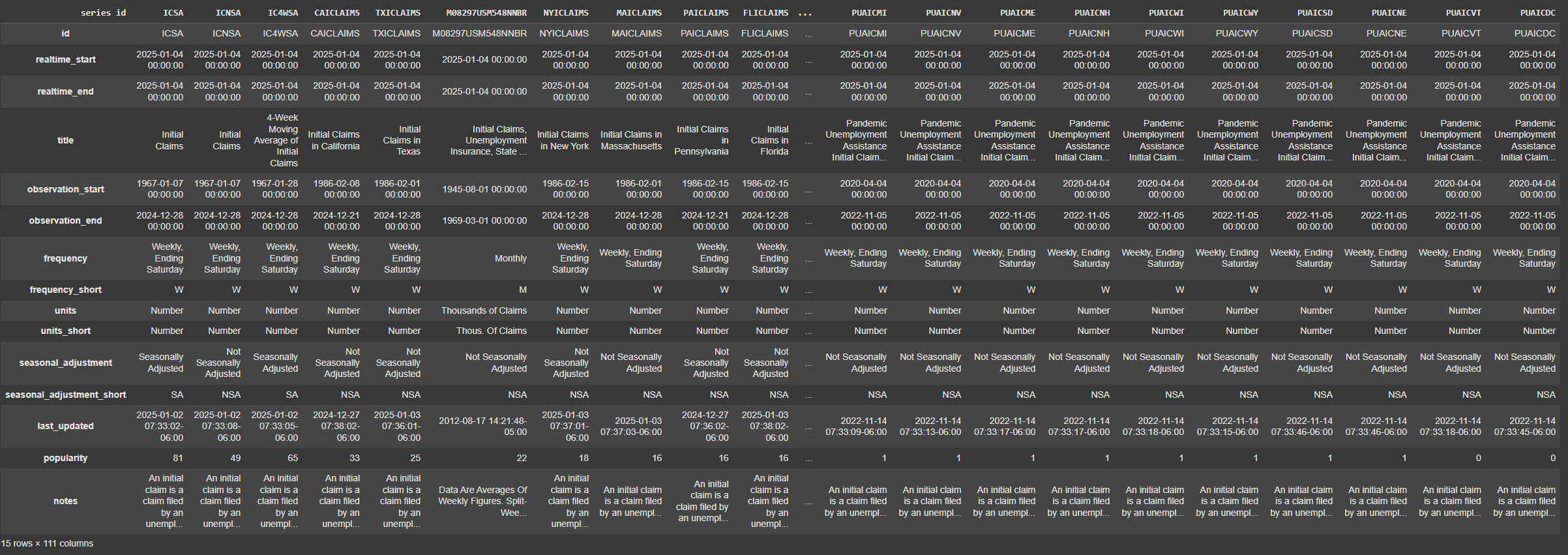
The search results include hundreds of related data series, such as state-level claims. FRED conveniently provides a popularity rating for indicators, so the most widely-used ones appear first. It also gives you some details about each data series, such as frequency, units of measurement, etc. The series we are interested in is ICNSA, which represents nationwide initial claims without seasonal adjustments.
What Are Initial Jobless Claims?
Initial Jobless Claims measure the number of individuals filing for unemployment benefits for the first time after losing their jobs. This indicator is one of the few economic metrics reported on a weekly basis, offering near real-time insights into the labor market. Many key economic indicators are released with a considerable lag. For example, GDP reports are released quarterly, non-farm payrolls are released monthly, etc. One notable exception is the Department of Labor’s weekly unemployment insurance (UI) claims data: They began reporting these data at a weekly frequency in 1945, and the series in FRED goes back to 1967.
Two key series from the UI report are initial claims and continued claims. An initial claim is a claim filed by an unemployed individual after a separation from an employer. The claimant requests a determination of basic eligibility for the UI program. While some claims may later be rejected, initial claims is still a good measure of the flow of individuals into unemployment. When an initial claim is filed with a state, certain programmatic activities take place and these result in activity counts including the count of initial claims.
Continued claims is the stock of individuals who have received unemployment insurance benefits the prior week and have again filed for continued benefits. While continued claims are not a leading indicator (they roughly coincide with economic cycles at their peaks and lag at cycle troughs), they provide confirming evidence of the direction of the U.S. economy. While people can be unemployed and not receive UI benefits (such as recent graduates searching for their first job), UI data have historically provided an accurate picture of where the national unemployment rate is headed.
Why Use Unadjusted Claims Data?
We use unadjusted claims data because it allows for direct year-to-year comparisons. While seasonally adjusted data can be useful for comparing levels of claims on a week-to-week basis, this adjustment is not trivial to get right. These are weekly administrative data which are difficult to seasonally adjust, making the series subject to some volatility.
Plotting Initial Jobless Claims Over Time
Next, let’s visualize initial jobless claims by week of the year across multiple years. The code below pulls the data series we need, converts it to a dataframe and adds columns Year and WeekofYear that we will be using to make a plot of the series.
df = fred.get_series_first_release('ICNSA')
df_frame = df.to_frame()
df_frame['WeekOfYear'] = df_frame.index.isocalendar().week
df_frame['Year'] = df_frame.index.year
Next, we make the plot we want: on the x-axis we will have the week of the year; each line will represent the claims in a specific calendar year. We also make the 2024, 2023 and 2022 values bold, and the rest of the lines see-through. Finally, we remove 2020, since it will mess up the chart with its millions of claims each week due to the pandemic.
import matplotlib.pyplot as plt

# Filter data to include years from 1980 onwards and exclude 2020
filtered_df = df_frame[(df_frame['Year'] >= 1980) & (df_frame['Year'] != 2020)]

# Create the plot with a larger figure size
fig, ax = plt.subplots(figsize=(14, 8))  # Increased figure size

# Make a dictionary to store legend handles and labels
legend_handles = []

# Group data by year, each year will be a line
for year, data in filtered_df.groupby('Year'):
    # Sort by WeekOfYear
    data = data.sort_values(by='WeekOfYear')

    # Set properties for 2024, 2023, 2022, and other years
    if year == 2024:
        line, = ax.plot(data['WeekOfYear'], data['value'], linestyle='solid', linewidth=2.5, alpha=1.0, label=year)
    elif year in [2023, 2022]:
        line, = ax.plot(data['WeekOfYear'], data['value'], linestyle='solid', linewidth=2.0, alpha=0.8, label=year)
    else:
        line, = ax.plot(data['WeekOfYear'], data['value'], linestyle='dotted', linewidth=1.0, alpha=0.5, label=year)

    # Store legend handles for the legend
    legend_handles.append(line)

# finalize the graph
ax.set_xlabel('Week of Year', fontsize=12)
ax.set_ylabel('ICNSA Value', fontsize=12)
ax.set_title('ICNSA Values by Week and Year (From 1980, exclusing 2020)', fontsize=16)
ax.grid(True)

# Move legend below the chart
ax.legend(handles=legend_handles, fontsize=10, ncol=6, bbox_to_anchor=(0.5, -0.1), loc='upper center', frameon=False)

# Adjust layout to make room for the legend
plt.tight_layout(rect=[0, 0.05, 1, 1])

plt.show()
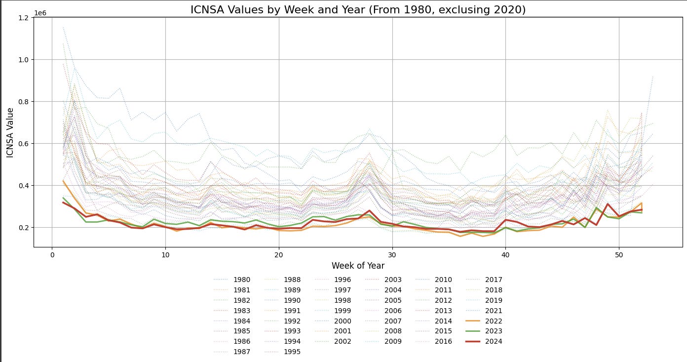
There are two big takeaways we can make from looking at this chart. First, this chart clearly suggests that the post-pandemic job market in the US is historically strong, with initial claims in 2022, 2023 and 2024 being some of the lowest in the last 40 years. Second, in 2024 the job market cooled off only moderately: initial claims in 2024 were higher only some of the weeks compared to 2022 and 2023. Going forward, this chart will be a useful tool to evaluate the health of the labor market in 2025 and adjust our decisions accordingly.
Looking ahead
Initial Jobless Claims are just one of the many indicators available for free through FRED. In future posts, I’ll explore other macroeconomic indicators and discuss how to use them for investment decision-making. Stay tuned and subscribe to follow along!