


Combining Clustering and Random Forest models to beat the market
Can adding a Random Forest model to our strategy beat Buy-and-Hold?

In this post we try to enhance our previous strategy that used a Clustering model to beat Buy-and-hold benchmark. We will now try to use a Random Forest machine learning model to determine when to hold a stock and compare the back tested results to only using a Clustering model as well as the benchmark Buy-and-Hold approach. You can read through the previous post below to familiarise yourself with the code and our approach to using a Clustering model.
Using clustering to level up your trading

In this post I continue my series to share Python code and my thoughts on various techniques that can help you level up your trading. This is the third post in the series and is all about using clustering to distinguish between favorable and unfavourable conditions for holding a stock.
We will be trying our approach on Microsoft stock (Ticker: MSFT). As always, I will provide the full code, so you can reproduce the results and play around with the code. I will only be commenting on the outputs for this post, if you want a more detailed breakdown of what the code means, refer to the previous post above.
import yfinance as yf

df = yf.download('MSFT').reset_index()

!pip install kneed

import tensorflow as tf
from tensorflow.keras import layers
from tensorflow.keras import regularizers
import pandas as pd
import numpy as np
seed=0
import os
os.environ['PYTHONHASHSEED'] = str(seed)
# For working on GPUs from "TensorFlow Determinism"
os.environ["TF_DETERMINISTIC_OPS"] = str(seed)
import numpy as np
np.random.seed(seed)
import random
random.seed(seed)
import tensorflow as tf
tf.random.set_seed(seed)

# Feature deriving

# Distance from the moving averages
for m in [10, 20, 30, 50, 100]:
    df[f'feat_dist_from_ma_{m}'] = df['Close']/df['Close'].rolling(m).mean()-1

# Distance from n day max/min
for m in [3, 5, 10, 15, 20, 30, 50, 100]:
    df[f'feat_dist_from_max_{m}'] = df['Close']/df['High'].rolling(m).max()-1
    df[f'feat_dist_from_min_{m}'] = df['Close']/df['Low'].rolling(m).min()-1

# Price distance
for m in [1, 2, 3, 4, 5, 10, 15, 20, 30, 50, 100]:
    df[f'feat_price_dist_{m}'] = df['Close']/df['Close'].shift(m)-1


# Relative Strength Index (RSI) - 14 days
def calculate_rsi(series, window=14):
    series_copy = series.copy()  # Work with a copy
    diff = series_copy.diff(1)
    gain = np.where(diff > 0, diff, 0)
    loss = np.where(diff < 0, -diff, 0)

    avg_gain = pd.Series(gain).rolling(window=window, min_periods=14).mean()
    avg_loss = pd.Series(loss).rolling(window=window, min_periods=14).mean()

    rs = avg_gain / avg_loss
    rsi = 100 - (100 / (1 + rs))

    df.loc[:, 'feat_rsi_14'] = rsi  # Use .loc to explicitly modify the DataFrame

# Call the function with the 'Close' column
calculate_rsi(df['Close'])

# Price change over the last 5 and 10 days
df['feat_price_change_5'] = df['Close'].pct_change(periods=5)
df['feat_price_change_10'] = df['Close'].pct_change(periods=10)

# 1 day performance
df['pct_change_future'] = df['Close'].pct_change().shift(-1)


# Adding a new column 'target' based on pct_change_future
df['target'] = np.where(df['pct_change_future'] > 0, 1, 0)

df = df.dropna()

df_train = df[df['Date'] < '2019-01-01'].reset_index(drop=True)
df_test = df[df['Date'] >= '2019-01-01'].reset_index(drop=True)

feat_cols = [col for col in df.columns if 'feat' in col]

df = df.dropna()
df_train = df_train.dropna()
df_test = df_test.dropna()

#begin clustering

import matplotlib.pyplot as plt


from sklearn.cluster import KMeans
from kneed import KneeLocator
from sklearn.preprocessing import StandardScaler
# Reset index of df_train to align with x_train_scaled_df
#df_train_reset = df_train.reset_index(drop=True)
# Initialize the StandardScaler
scaler = StandardScaler()
x_train = df_train[feat_cols]
x_train_scaled = scaler.fit_transform(x_train)
x_train_scaled_df = pd.DataFrame(x_train_scaled, columns=feat_cols)
wcss = []
k_range = range(2, 30)

for k in k_range:
    kmeans = KMeans(n_clusters=k, random_state=42, n_init='auto')
    kmeans.fit(x_train_scaled_df)
    wcss.append(kmeans.inertia_)

elbow_locator = KneeLocator(k_range, wcss, curve='convex', direction='decreasing')
optimal_k = elbow_locator.elbow

print(f'Optimal k: {optimal_k}')

plt.plot(k_range, wcss, marker='o')
plt.title('Elbow Method for Optimal k')
plt.xlabel('Number of Clusters (k)')
plt.ylabel('Within-Cluster Sum of Squares (WCSS)')
plt.grid(True)
plt.show()

optimal_kmeans = KMeans(n_clusters=optimal_k, random_state=42, n_init='auto')
optimal_kmeans.fit(x_train_scaled_df)

# Add the 'cluster' column to df_train
df_train['cluster'] = optimal_kmeans.predict(x_train_scaled_df)

# Calculate cumulative returns for each cluster
cluster_cum_returns = (df_train.groupby('cluster')['pct_change_future'].cumsum())

# Plot cumulative returns for each cluster
plt.figure(figsize=(12, 6))
for cluster, data in cluster_cum_returns.groupby(df_train['cluster']):
    plt.plot(df_train.loc[data.index, 'Date'], data, label=f'Cluster {cluster}')

plt.title('Cumulative Returns for Each Cluster')
plt.xlabel('Date')
plt.ylabel('Cumulative Returns')
plt.legend()
plt.show()
Our first step is to determine which clusters are good and which ones are bad, the returns for each cluster determined by the model are shown on the graph above. We also visualize each cluster with the code below to get a better idea of which clusters we want to avoid
import plotly.express as px

df_plot = df_train[df_train['Date'] > '2016-01-01']

fig = px.scatter(
    df_plot,
    x='Date',
    y='Close',
    color='cluster',
    color_continuous_scale='rainbow',
    title='Cluster Analysis - Training',
)

# Customize the axis labels
fig.update_xaxes(title_text='Date')
fig.update_yaxes(title_text='Close')

# Show the plot
fig.show()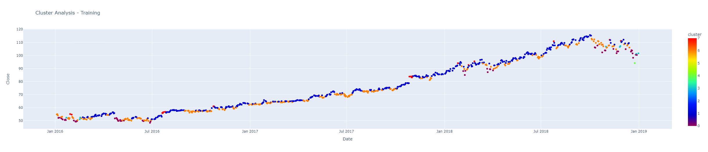
Looking at each cluster’s returns and taking a look at each of them on the chart above, it seems that clusters 3, 5, 6 and 7 show underwhelming performance, so we will leave them out and designate the remaining clusters as “good clusters”
import numpy as np

good_clusters = [0,1,2,4]

df_plot['good_cluster'] = np.where(df_plot['cluster'].isin(good_clusters), 1, 0)

fig = px.scatter(
    df_plot,
    x='Date',
    y='Close',
    color='good_cluster',
    color_continuous_scale='plotly3',
    title='Cluster Analysis - Training',
)

# Customize the axis labels
fig.update_xaxes(title_text='Date')
fig.update_yaxes(title_text='Close')

# Show the plot
fig.show()
In the chart above “good clusters” are marked as pink dots, while bad clusters are marked as blue dots. Overall, it seems like a decent choice, so we will proceed with this selection. Let’s now check out what the clustering looks like on Test data that the model had no access to.
x_test = df_test[feat_cols]
x_test_scaled = scaler.transform(x_test)
x_test_scaled_df = pd.DataFrame(x_test_scaled, columns=feat_cols)

df_test['cluster'] = optimal_kmeans.predict(x_test_scaled_df)

fig = px.scatter(
    df_test,
    x='Date',
    y='Close',
    color='cluster',
    color_continuous_scale='rainbow',
    title='Cluster Analysis - Testing',
)

# Customize the axis labels
fig.update_xaxes(title_text='Date')
fig.update_yaxes(title_text='Close')

# Show the plot
fig.show()
The Test clusters are pretty close to Training clusters, although some clusters that we chose to eliminate are a bit more prevalent. Let’s check what the good clusters would look like on Test data.
import numpy as np

df_test['good_cluster'] = np.where(df_test['cluster'].isin(good_clusters), 1, 0)

fig = px.scatter(
    df_test,
    x='Date',
    y='Close',
    color='good_cluster',
    color_continuous_scale='plotly3',
    title='Cluster Analysis - Testing Set',
)

# Customize the axis labels
fig.update_xaxes(title_text='Date')
fig.update_yaxes(title_text='Close')

# Show the plot
fig.show()
Once again, pink dots represent good clusters when we are long the stock and we stay out on blue days. The results look promising, the strategy seems to stay out during corrections or when the stock is looking too stretched.
Now let’s check out how our Clustering strategy performs over a backtest.
from plotly import graph_objects as go

df_test['pct_change'] = df_test['Close'].pct_change()
df_test['signal'] = df_test['good_cluster'].shift(1)

df_test['equity_cluster'] = np.cumprod(1+df_test['signal']*df_test['pct_change'])
df_test['equity_buy_and_hold'] = np.cumprod(1+df_test['pct_change'])

fig = go.Figure()
df_test = df_test.dropna()
fig.add_trace(
    go.Line(x=df_test['Date'], y=df_test['equity_buy_and_hold'], name='Buy and Hold')
)

fig.add_trace(
    go.Line(x=df_test['Date'], y=df_test['equity_cluster'], name='Clustering')
)

fig.update_layout(
    title_text='Clustering Backtest',
    legend={'x': 0, 'y':-0.05, 'orientation': 'h'},
    xaxis={'title': 'Date'},
    yaxis={'title': 'Multiple from Initial Investment'}
)
The graph above shows that our Clustering strategy ends up beating the Buy-and-Hold benchmark, although it has a pretty long stretch of underperformance. Let’s see if we can improve on it by adding a Random Forest model that would get us in and out of the market.
df_test = df_test.rename(columns={'cluster': 'feat_cluster'})
df_train = df_train.rename(columns={'cluster': 'feat_cluster'})
feat_cols = [col for col in df_train.columns if 'feat' in col]

from sklearn.ensemble import RandomForestClassifier
from sklearn.metrics import accuracy_score, precision_score


x_train = df_train[feat_cols]
y_train = df_train['target']

x_test = df_test[feat_cols]
y_test = df_test['target']
x_train = scaler.fit_transform(x_train)
x_train = pd.DataFrame(x_train, columns=feat_cols)
x_test = scaler.transform(x_test)
x_test = pd.DataFrame(x_test, columns=feat_cols)

clf = RandomForestClassifier(
    n_estimators=100,
    max_depth=5,
    random_state=42,
    class_weight='balanced',
    n_jobs=-1,
)

clf.fit(x_train, y_train)

y_train_pred = clf.predict(x_train)
y_test_pred = clf.predict(x_test)

# Calculate accuracy and precision for training data
train_accuracy = accuracy_score(y_train, y_train_pred)
train_precision = precision_score(y_train, y_train_pred)

# Calculate accuracy and precision for test data
test_accuracy = accuracy_score(y_test, y_test_pred)
test_precision = precision_score(y_test, y_test_pred)

print(f'Training Accuracy: {train_accuracy}')
print(f'Training Precision: {train_precision}')
print('')
print(f'Test Accuracy: {test_accuracy}')
print(f'Test Precision: {test_precision}')
In the code block above we first add the new cluster column and use it as one of the features that our Random Forest model will use to give us a prediction. We then scale the data and train the Random Forest Classifier model that will return a 1 when it predicts that the stock performance over the next day will be positive. We also get a reading of the precision and accuracy of the model. Let’s see when exactly the model has us buy the stock.
import numpy as np

df_test['rf_pred'] = (clf.predict_proba(x_test)[:, 1] > 0.5).astype(int)

fig = px.scatter(
    df_test,
    x='Date',
    y='Close',
    color='rf_pred',
    color_continuous_scale='viridis',
    title='Cluster Analysis - Testing Set',
)

# Customize the axis labels
fig.update_xaxes(title_text='Date')
fig.update_yaxes(title_text='Close')

# Show the plot
fig.show()
In the graph above the yellow dots are when we are long the stock. It seems pretty decent at first glance, let’s check out the backtest.
df_test['rf_signal'] = df_test['rf_pred'].shift(1)
df_test['equity_rf'] = np.cumprod(1+df_test['rf_signal']*df_test['pct_change'])

fig = go.Figure()

fig.add_trace(
    go.Line(x=df_test['Date'], y=df_test['equity_buy_and_hold'], name='Buy and Hold')
)

fig.add_trace(
    go.Line(x=df_test['Date'], y=df_test['equity_cluster'], name='Clustering')
)

fig.add_trace(
    go.Line(x=df_test['Date'], y=df_test['equity_rf'], name='Random Forest')
)

fig.update_layout(
    title_text='Clustering & RF Backtest',
    legend={'x': 0, 'y':-0.05, 'orientation': 'h'},
    xaxis={'title': 'Date'},
    yaxis={'title': 'Multiple from Initial Investment'}
)
The graph above shows us that both the Clustering and Random Forest models lagged the Buy-and-Hold approach until the crash of 2020, after which both strategies pulled ahead. After that both strategies show pretty consistent performance and end up beating the benchmark, with our Random Forest ending up beating out the competition. Let’s also check out the drawdowns of all the approaches.
def get_max_drawdown(col):
    drawdown = col/col.cummax()-1
    return 100*drawdown.min()

def calculate_cagr(col, n_years):
    cagr = (col.values[-1]/col.values[0])**(1/n_years)-1
    return 100*cagr

print('Maximum Drawdown Buy and Hold:', get_max_drawdown(df_test['equity_buy_and_hold']))
print('Maximum Drawdown Clustering:', get_max_drawdown(df_test['equity_cluster']))
print('Maximum Drawdown Random Forest:', get_max_drawdown(df_test['equity_rf']))

print('')

n_years = (df_test['Date'].max()-df_test['Date'].min()).days/365.25

print('CAGR Buy and Hold:', calculate_cagr(df_test['equity_buy_and_hold'].dropna(), n_years))
print('CAGR Clustering:', calculate_cagr(df_test['equity_cluster'].dropna(), n_years))
print('CAGR Random Forest:', calculate_cagr(df_test['equity_rf'].dropna(), n_years))
Maximum Drawdown Buy and Hold: -37.55
Maximum Drawdown Clustering: -16.36
Maximum Drawdown Random Forest: -10.79
CAGR Buy and Hold: 32.32
CAGR Clustering: 32.65
CAGR Random Forest: 33.05
The big difference between our strategies and the Buy-and-Hold benchmark is the drawdown metric, with the Random Forest Model showing some very worthwhile metrics.
If you found this post useful, make sure to subscribe, as I will continue to make posts that could help you level up your investing strategies. Next, I plan to look into a more effective way to choose good clusters, since the current approach is rather crude.
If you have any questions, don’t hesitate to ask them in the comments, I would be happy to help out!